TestimonialGrid Component
Showcases your product in action with demonstration media and explanatory text.
Overview
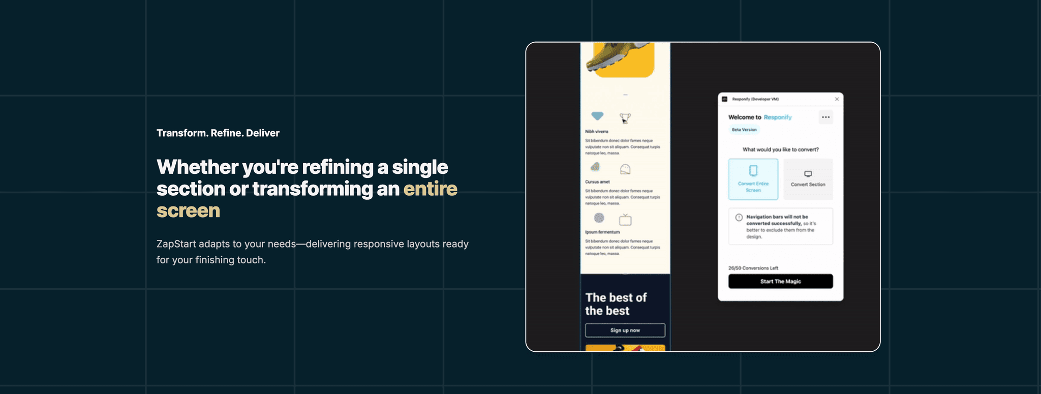
The TutorialSection component showcases your product in action with demonstration media and explanatory text. It features a bold headline with gradient text accents, adapts to different screen sizes with responsive layout, uses contrasting background to make content stand out, and showcases product functionality through visual demonstration. You add your video or gif here.
More docs about tips and how it works in the Component's file
import TutorialSection from "@/components/TutorialSection";

// In your pricing page
export default function LandingPage() {
  return (
    <div className="container mx-auto py-12">
      <TutorialSection />
    </div>
  );
}
Place this section after your hero to demonstrate your product's functionality and value proposition with a visual example.